

As you probably know the Penguins are set to unveil a new third alternate jersey for the upcoming season, what jersey that should be has become a topic of heated debate with the fanbase. There is the diagonal PITTSBURGH. There is robo-Penguin. There is something new/ a frankenstein of the past. What many do not know is that the official league jersey list was leaked online last week before being removed (though you can still find it with effort), on it the Penguins were listed as not having 3, but 4 uniforms for the upcoming year. Not only will the Pens be introducing a new third alternate sweater this season, but they will also be wearing an entirely different set of threads for their outdoor tilt against the Flyers. With all of the talk of which uniform the Pens should use basically becoming a shouting match on Twitter I thought it would be fun to take a dive through the history of the sweaters that the great men of this organization have worn.
1967-1968
During the inaugural year the Penguins went with the diagonal PITTSBURGH in the teams original colors. The team also introduced the skating Penguin logo but it was not found on the uniforms during the first season. I don’t know why but I have always been a sucker for the white version of this uniform, and feel it would’ve made a much better alternate than the navy one we got a few years ago (more on that later).

The jerseys would see exactly one season of action before the team decided to switch things up and put the logo on the sweater.
1968-1972

The only adjustment to the logo was the Penguin losing his/her scarf, other than that these were the uniforms that were associated with the beginning of Penguins hockey. The team would sport these threads for 4 seasons until another logo change was made when the Penguin was released from within the circle and the writing was removed from the uniforms.
1972-1980


In my opinion this was the saddest era of Penguins uniforms, now that I have typed that they are most likely going to release one of these four as the new alternate today. There are aspects of each uniform that are nice, like the diagonal lines on the sleeves on three of them as well as the 4 stripes on the bottom. The Penguins would wear a variation of these four designs for 8 seasons, resulting in 5 playoff berths that ended with 3 first round losses and 2 second round defeats. The color combinations are just… I can’t. On October 17th, 1979 the Pittsburgh Pirates completed their comeback from a 3-1 series deficit to secure their 5th (and most recent) World Series title, the championship marked the second World Series in the 70’s for the Pirates. A few months later on January 20th, 1980 the Steelers defeated the Los Angeles Rams to secure their 4th Super Bowl in 6 years. To celebrate the success of their professional athletic counterparts, and to help drive attendance to the Igloo the Penguins honored the Pirates and Steelers on January 30th, 1980 when they wore black and gold for the first time in a game against the Blues:
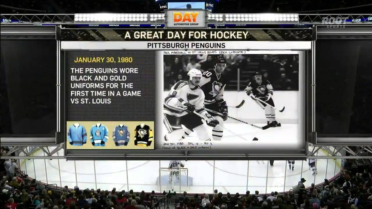
During the offseason the front office decided the Black and Gold was a hit, and for a team that was trying to find an identity and boost ticket sales slipping behind the identity of championship winning neighbors seemed like a good idea as the team would wear the new uniforms for the entire 1980 season before introducing a third part of the collection.
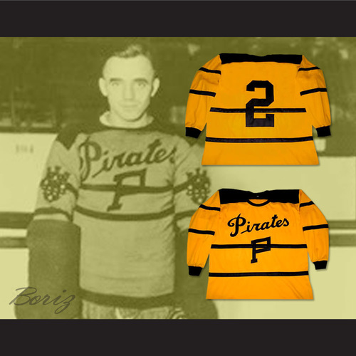
The Boston Bruins front office protested the jersey change to the NHL stating that these colors have and should always be associated with the Bruins and the Bruins only. The Penguins apparently used OJs lawyer, who reminded the league that from 1925-1930 the city of Pittsburgh had an NHL team named the Pittsburgh Pirates and their uniform color scheme…
For what it is worth, the Boston Bruins first season was also in 1924, a season that saw them wear Brown (not black) and Gold:
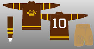
It wasn’t until the Pittsburgh Pirates hockey club had dismantled in the early 30’s that the Bruins first wore black and gold, it should come as no surprise that a sports team from Boston lied.
1981-1984
The Penguins would wear the black jersey in every road game and alternate the white and the gold at home during the 5 seasons. The 1985 season would be the final season of the gold uniform rotating in the mix. This rotation of uniforms looks a lot like something the Penguins may do this year, no?
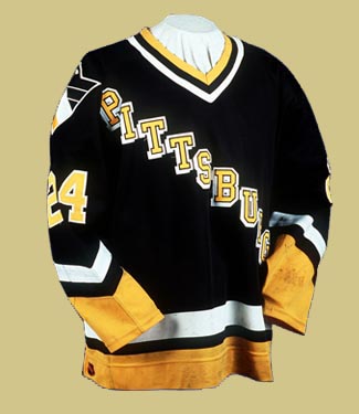
1986-1993

After dropping the gold uniform from the mix the Penguins took the numbers off of the shoulders and placed them lower on the arms, gave both uniforms horizontal bands on the sleeves and waist (notice how thin the yellow band is on the white uniform compared to the version the team wears today), and started adding various patches. These uniforms became synonymous with success in the early 90’s, and for many fans 30 or younger, served as a reminder of the “good ole’ days” for many years.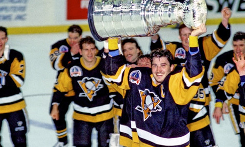
After winning back-to-back Stanley Cups in 1991 and 1992 the team made their first uniform change in 7 years when they reinvented the Penguin logo and designed two different looking uniforms, for the first time in franchise history to home and away jerseys wouldn’t be mirror images of each other as both would have its own identity.
1992-1995
The home uniform during this span featured the new Penguin logo which has become known as the Flying Pigeon. The uniform also reintroduced diagonal sleeve trim and a modern angled shoulder striping. 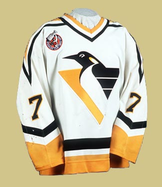
The team also went back in history to update a classic with the new colors for their home uniforms during those seasons:
The sleeve striping remained angled with the modern Penguin logo on the shoulder. In 1995 five NHL teams introduced new alternate jerseys and you bet the Penguins were one of them, debuting the new threads on January 27th, 1996.
The Penguins would rotate the trio of uniforms for the next few years, with the above jersey replacing the diagonal PITTSBURGH uniform for the 1997-98 season as the teams away sweater.
The Penguins would use this duo with white at home and black on the road for two full seasons before the next alternate uniform was introduced in 1999 which brought the skating Penguin back to the spotlight after a 6 year hiatus. 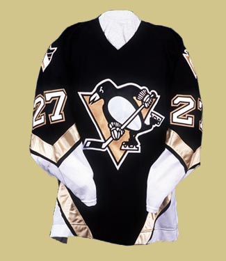
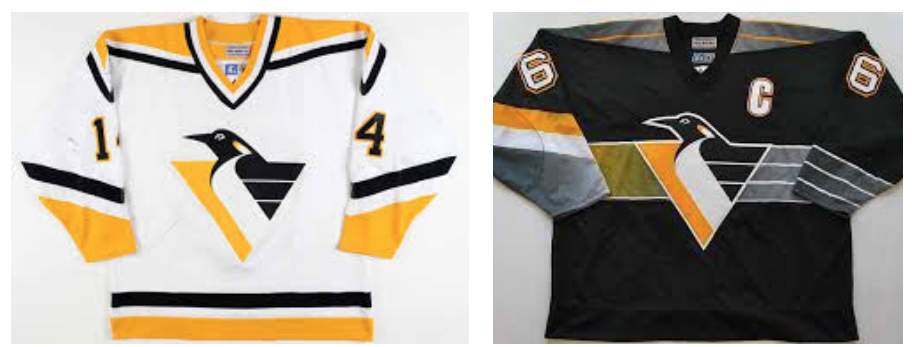
The uniform carried on the angled sleeve striping with a new pattern of stripes on the waist. It was also the introduction of Vegas Gold into the organization while still sporting the modern Penguin on the shoulders. The uniform remained an alternate in the rotation until 2002 when it was joined by a white counterpart as the new team uniforms.
2002-2007
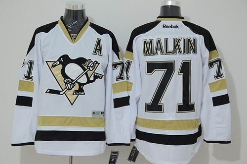
To many this set of threads represents the dark ages of Penguins hockey. They also represent the rebirth of the organization, the only uniform shared by Mario Lemieux, Sidney Crosby and Evgeni Malkin. The team would wear these uniforms through the 2007 season when the NHL uniform deal with CCM expired and Reebok took over, giving every team an update that focused on playability first and aesthetics last.
2008-2014

It was with these uniforms that the Las Vegas gold lost its shimmer and started to look more like a shade of brown found in a diaper. In 2008 the NHL introduced the Winter Classic with the Penguins participating in the inaugural event. As the game went back to its outdoor roots the Penguins decided to do the same with the game uniform that would eventually become the new alternate
Personally I loved that the team did this as a throwback and even though it took zero imagination they knocked this jersey out of the park. Under the leadership of Crosby the Penguins made sure the Reebok Las Vegas brown era will always be remembered
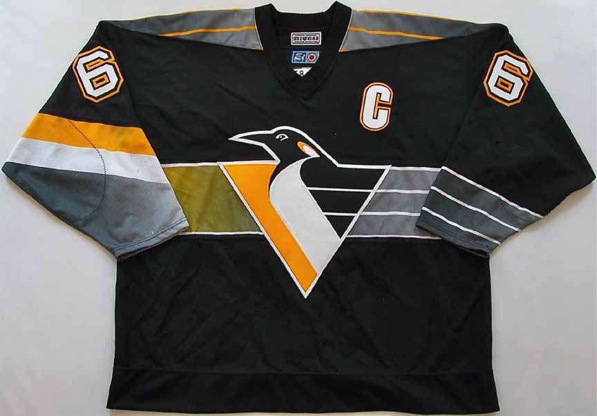
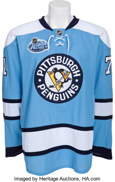
The “Baby Blues” with the Las Vegas gold were used from 2008 until 2011 when the Blues were retired and the Penguins were getting ready to play in their second Winter Classic leading to a new uniform. The second Winter Classic saw the team stick with the blue theme when they introduced a uniform that went from crowd favorite to cursed within a week:
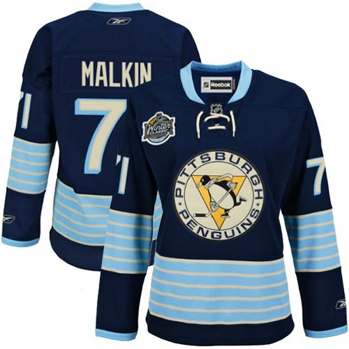
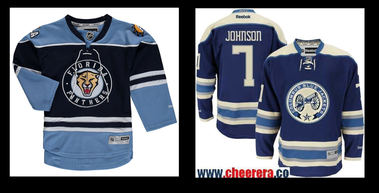
The Penguins would suffer through the curse of the navy for three seasons between 2011-2013. The jersey design itself was a good design considering it was original to the organization and not just a copy of a previous uniform with different colors, however there were multiple other teams including the Blue Jackets and Panthers already wearing similar designs as thirds:
The main issue with the uniform is that it was introduced during a game being held at Heinz Field which presented as a perfect opportunity for the Pens to bring black and yellow back into their color scheme, a disappointing oversight. The second issue with the uniform is that it will unfortunately always be associated with Crosby’s concussion as well as multiple other freak injuries to various players.
In the summer of 2013 the Penguins released the promo video that got an entire fanbase hyped. It was simple. It was Mike Lange screaming one of his signature catchphrases while Sidney Crosby appeared in the uniform that everyone associated with Pittsburgh hockey.
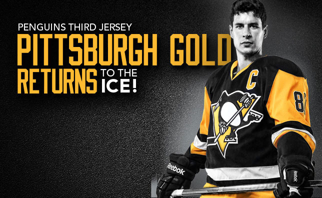
The new third jersey quickly became a fan favorite and a top seller as that beautiful shade of yellow once again skated across the ice. When juxtaposed against the still Vegas gold center ice logo it was clear to the organization what the next step was. For the two seasons between 2014-16 the Penguins would continue to wear the Vegas Gold jerseys with the black and yellow as a third jersey used at home. In 2014 the Pens would play an outdoor game as part of the NHL Stadium Series against the Blackhawks which saw the team get a one time use uniform as the league attempted a “chrome” look for all teams participating in a series game.
The jersey appeared in that game and that game alone mainly because it was horrible.
The team would slowly begin introducing the once alternate black and yellow jersey as their home uniform as they made more and more appearances, and were eventually announced as the home jersey during the 2015-16 playoffs, a playoff year which served as a swan song for the Las Vegas gold which went out with yet another cover shot.
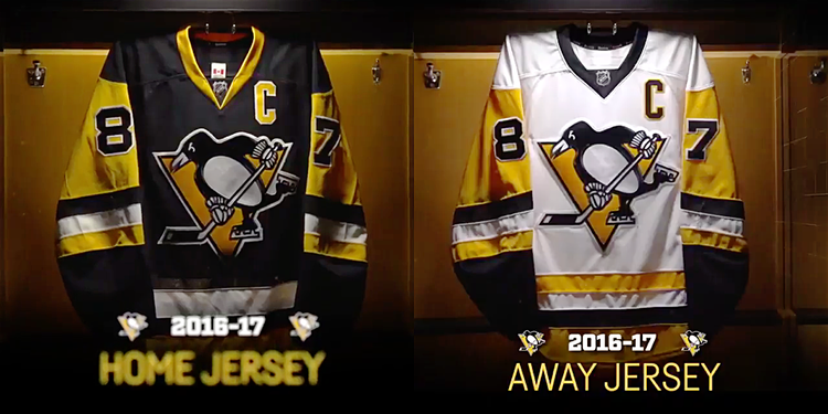
2016-present
Following their Stanley Cup victory the Penguins completed the comeback when they erased the Vegas Gold from their inventory, going back to the basics with their current home and away set.
#jerseyporn
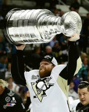
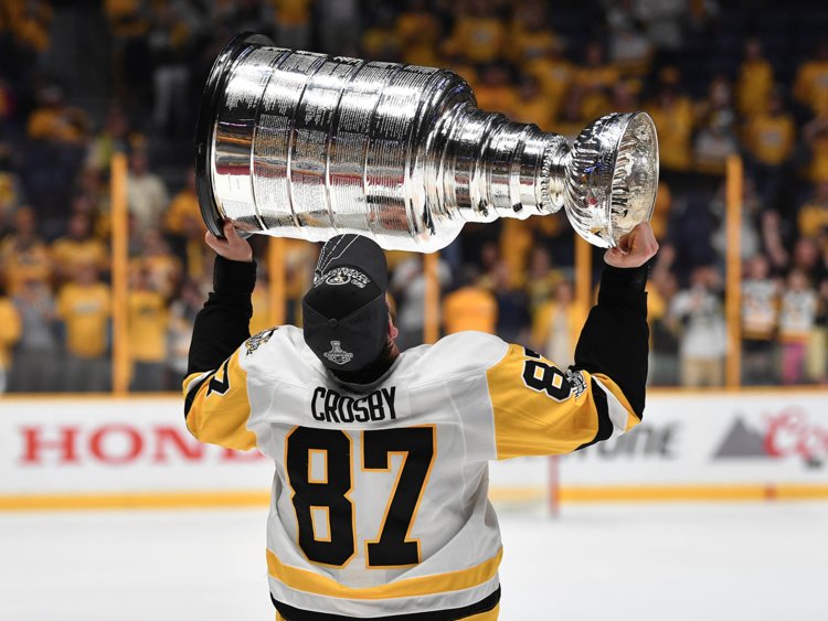
The Penguins then etched the new whites into history with their Stanley Cup victory in Nashville
Since 2016 the Penguins have worn this duo in every game except for the Stadium Series matchup against Philadelphia on February 25th, 2017 when the Penguins finally did the right thing for a game being played in the home of the Steelers, honoring the team with black and yellow
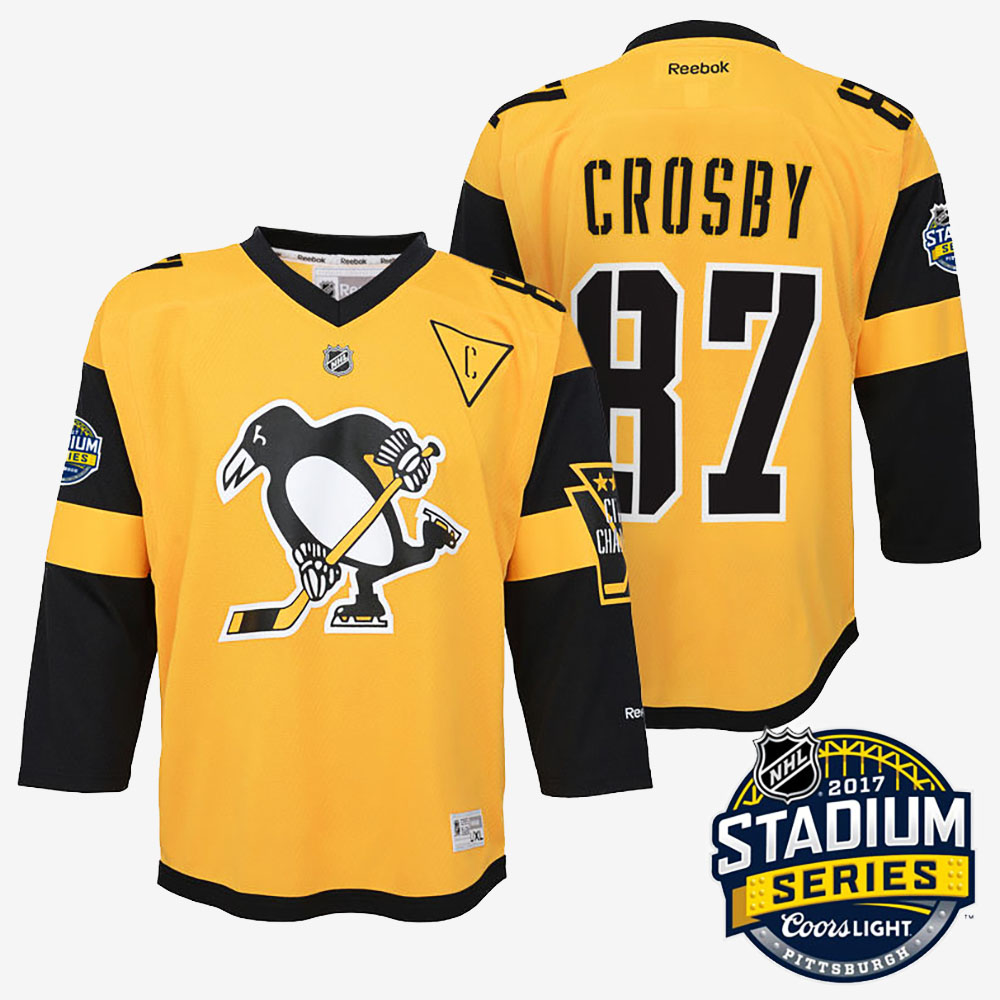
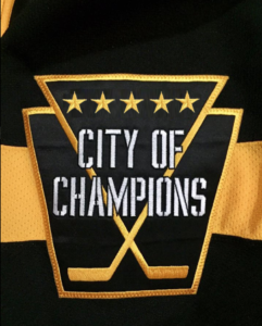
This uniform was hit or miss with the fans, but in my opinion was the best outdoor uniform that the team introduced next to the Baby Blues. Mixed in with the opposing Flyers wearing a Black uniform and the league finally got it right as the main colors on the ice at Heinz field were black and yellow. Plus, that City of Champions patch is still sick AF (yes I added in a 5th star).
That brings us to the present day as we wait for the announcement that will begin the next chapter in Penguins uniform history. As mentioned in the beginning the team is speculated to be releasing two different uniforms this season. So far five teams have revealed their new third jerseys, with three being throwback replicas and two being new designs:
Third jersey gang. @FaZeCBass @TacTixHD @TDIHockey @adidashockey @EASPORTSNHL #HERETOCREATE pic.twitter.com/K8hEdeutIS
— Nasher (@TheNasher61) August 14, 2018
https://twitter.com/NJDevils/status/1031995505910472704
The Coyotes and Ducks were gifted easy slam dunks and they capitalized. The Devils also scored big by cashing in on a design that many New Jersey faithful have wanted for years (similar to the Pens fans during the Vegas Gold years). The Hurricanes new jersey has grown on me and I no longer hate it. The Flyers adapted their Stadium Series jersey and it sucks.
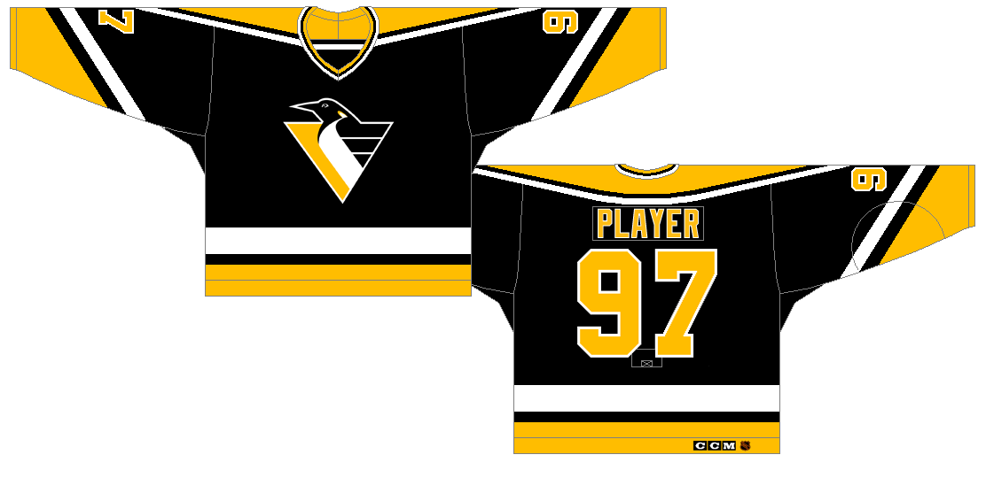
3 teams use throwbacks, 1 team uses a jersey it wore two years ago, the other designs a completely new uniform. Where does this leave the Pens if they are getting 2 uniforms? The Stadium Series uniform will all depend on what the home team Flyers will be wearing, which will either be black or orange. If the Flyers wear black it leaves the Penguins with either yellow or white, if the team has to wear white how sick would the diagonal PITTSBURGH look in black font with yellow outline on the chest with the angled sleeve stripes and current waist stripes? I can’t see the team designing another new yellow jersey after the last Stadium Series game, so either they won’t wear yellow or they will just reuse that uniform. If the Flyers wear orange however the Penguins will most likely have to wear black, much like when in Pittsburgh the teams wore the Pittsburgh colors, this game will most likely be orange and black. If the team has to wear black these unused 1993 alternates might be the combination fans are searching for:
Not going to lie, this would be a really cool uniform and I am all for it.
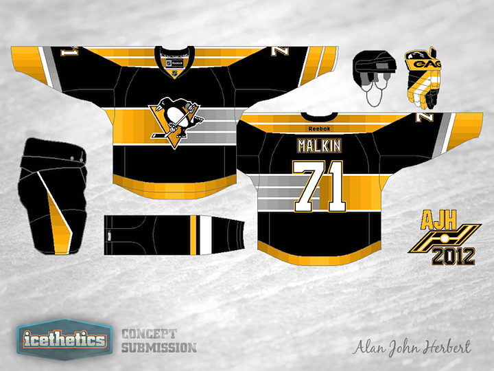
As for the new alternate, I feel a throwback is the most likely option given then plethora of jersey history however I am not at all opposed to a new design that combines multiple hints of the teams past. I will end this post with various designs created by users over at icethetics.co
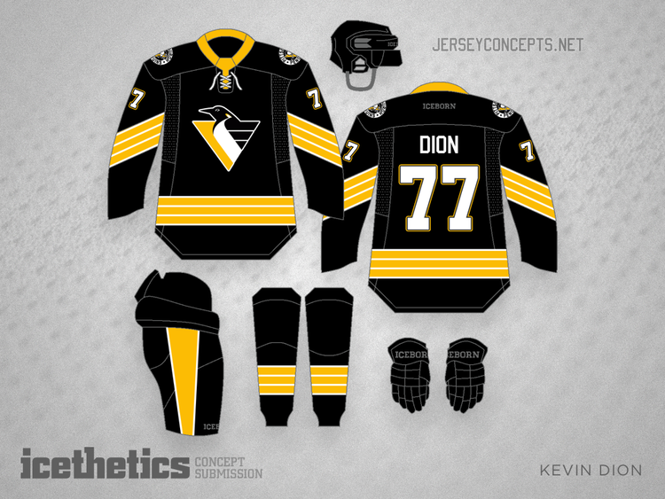
I understand what they are trying to do but the skating Penguin doesn’t work with the horizontal stripes, the “wings” of the flying pigeon logo is what made the stripes on the jersey work in the first place.
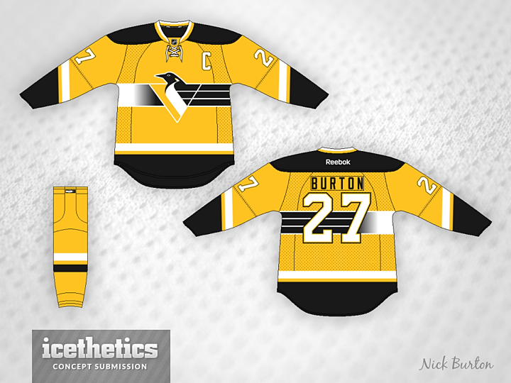
Pretty solid design, it isn’t hard to envision something like this as an alternate.
Now this is interesting, taking a traditional black uniform and making it yellow, it combines multiple things that the fans want while representing the past.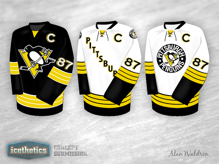
These were for the 2011 Winter Classic concept, but the middle uniform could be baller under the lights in the Stadium Series.
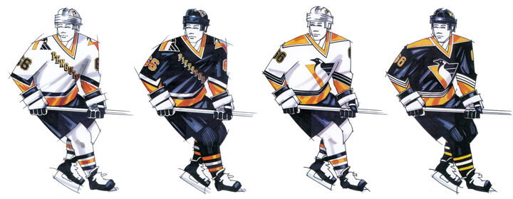
That far left uniform (with PITTSBURGH instead of PENGUINS) would be my choice if the team has to wear white during the Stadium Series. It gives both the Pigeon logo, the diagonal font and the angled stripes while being a white uniform, I am all in.
I hope you enjoyed this post, I look forward to the uniform debate in the comments below as well as an new designs you may come up with!
Current list of ticket requests for the December 1st blog meets world game, please double check your current order and let us know if it is wrong.
- – El_Wray: 2
- – Doge: 2
- – Ulfie: 1
- – Jovi: 1
- – Andy: 4
- – Gutsgonebad: 1
- – Southsidegeno: 1
- – Le Finn: 1
- – Vladamir: 2
- – Pen in Houston: 1
- – Ungaba: 1
- – Owyn999: 1
- – Rad: 2ish